About the Richard Powers Art blog...

I have been a fan of the art of Richard Powers before I ever knew the man's name. Growing up reading SF as a child, I marveled at the abstract surreal images from many of the paperback covers from the 50's and 60's. But it was not until many years later in 2000 that I encountered The Art of Richard Powers by Jane Frank and discovered the name behind the art I had loved -- Richard Powers.

Powers led a double life. He was not only one of the most prolific commercial artists of his day, but he was also a prolific fine artist who maintained an annual solo show at the Rehn Gallery in NY (among others) for three decades. It is interesting to note that there was often very little difference between his fine art abstract paintings and his commercial art book covers -- quite a feat!

He worked in many styles and media, and experimented endlessly. Although he could easily paint "realism", he favored (and was more challenged by) abstraction. For me personally, his art "scratches many itches". I love abstract surrealism, and I love SF. Powers art brought these two together in a brilliant way. Additionally, there is a wonderful sense of nostalgia to many of his images, invoking the art styles of their times. But above all, Powers work simply captivates me!

My goal for this blog is to provide a hub for sharing information about Richard Powers and his art, as well as interesting observations about his process. I hope you enjoy.

John A Davis

Our Lady of Darkness

Our Lady of Darkness

Wednesday, August 20, 2014

Recurring Dreams

Like many artists, Powers had favorite subjects he would return to time and again.  But whereas some artists may have favorite locations or models, Powers had favorite shapes.  He obviously enjoyed exploring certain shapes and visual ideas over and over.  It is not a case of running short of ideas (of which he had plenty).  Instead Powers created his own visual "language", and certain words bore repeating (albeit with different accents).

Powers played with many such motifs.  Here are just a few examples...

Meta-Heads
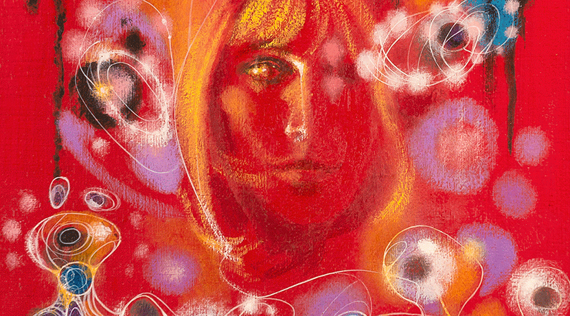
There is a tool in 3D modeling called "metaballs" that reminds me of a certain type of head motif that Powers sometimes used.  The effect achieves a different goal in each of these examples.  The meta-head of Aluminum Man gives the figure an intriguing appearance of "liquid metal" (long before Terminator 2).  The meta-head on the more realistic body in Time And Stars lends a horrifying loss of identity.  My favorite use of the meta-head is from On the Beach (bottom right) where the woman's head takes the appearance of a mushroom cloud -- brilliant!

From Richard Powers Art Blog
Minimal Man
What do you get when a meta-head finally pulls off the host body?  You get what I call the "minimal man".  This abstracted figure is disjointed and about as minimal as you can get.  Sometimes the head is connected, sometimes it just floats.  Sometimes there are 3 or 4 legs.  Why not?

From Richard Powers Art Blog
The Uprights
Another favorite shape idea is what I call the "uprights" because of their resemblance to football goal posts... complete with a "football" element (for three points)!

From Richard Powers Art Blog
Knives as Architecture
This is pretty self-explanatory, and certainly lends a bit of tension and danger to these future skylines.

From Richard Powers Art Blog
The Manta Shape
This interesting shape reminds me of a manta ray.  I find it fascinating that Powers decided to explore this shape again 16 years later (the amount of time between these two paintings).


From Richard Powers Art Blog

Saturday, August 16, 2014

Fold, Spindle, and Mutilate...

Powers was notorious for re-purposing his art.  He had no attachment to much of his commercial art and would regularly pull older art and slice it up for "raw materials" to be used in other images, much to the horror of  his reps (like Jane Frank).  Powers would merrily destroy the old to create the new, despite pleadings to cease and desist!

There have been many times I have marveled at a particular cover he did, only to discover he had later pillaged it to create another cover... it was gone forever.  Although it is easy to mourn the many classic covers that Powers destroyed in his creative process, it is a fascinating glimpse at the man and his art (and it is a fun game to find and associate his cannibalized works).

Get Out of My Sky  
Here Powers cut elements from the back of the wrap-around cover of Get Out of My Sky to include in Tiger by The Tail.  Does the front cover portion still exist?  Possibly, as we will see in the next example.


The Undying Fire
Powers was evidently bothered by the constraints of compositions inherent in wrap-around covers (or covers in general that must allow room for text).  He felt some of his commercial works had merit but needed cropping, so he might keep the front cover portion (for example) and cut off the back cover.  In the case of The Undying Fire, Powers kept the front cover portion (which exist today), but cannibalized the rear cover portion.

Lambda 1
Unfortunately THREE classic covers gave there lives for Lambda 1.
Sad but true : (
From Richard Powers Art Blog
Maze of Death
Here Powers actually jumps genres, taking one his mystery covers and turning it into a SF cover.  This is one instance where I actually don't mind.  However, I have a bad feeling a few other works were mutilated for the other elements we see in Maze of Death.


Search the Sky

Star Shine
Too bad, I liked Star Shine...

SF Omnibus
Here SF Omnibus got scattered over several pieces.  I know I have seen the other abstract figurative element on top appear on another cover as well.

From Richard Powers Art Blog

Friday, August 15, 2014

Powers... in 3D!

Powers was constantly experimenting with different media and techniques.  Towards the end of his life he was still trying new things and new forms of expression.  In the early 90's, Powers created a series sculpted mixed media pieces.  Many of these were done as shadow boxes and contained painted elements as well as the sculpts.  I believe the sculpted elements were done with wire and terracotta.  I acquired this particular piece (40x26x5.5) from the Powers estate through Jane Frank, and I was told it was the first of Powers' sculpted piece sold.  They are fragile and the estate was concerned.  I'm happy to report it survived the trip!  Since then, more of Powers sculpted pieces have been offered.

You can see them through the Baldwin Hill Gallery http://www.baldwinhillframing.com/more-about-richard-powers/

From Richard Powers Art Blog

Wednesday, August 13, 2014

Mutating Art

I have been collecting Richard's art for over a decade now and I am always surprised to find how much he continued to change, manipulate, or downright destroy his art (cut to pieces for mosaics in other work) after it was originally created.  Here are some examples that show how he would often alter his work for obvious aesthetic reasons (as opposed to restoration of damaged pieces), sometimes years after the original painting was done.

Tales of Love and Horror
Here Powers did some slight tweaks on the original art, most notably removing the "centipede bra", which perhaps was included originally for censorship reasons.

From Richard Powers Art Blog

Sometimes Never/Symphonie Fantastique
Here is an example of how Powers would re-purpose art by altering it to fit a different theme.  He eliminated some obvious SF elements from the book cover, shifting the painting into a more purely "fantastique" tone.


From Richard Powers Art Blog
Tau Zero
In this example, Powers completely painted over the original painting (seen on the book cover), using it as a guide.  At first glance the paintings may appear identical, but flipping back and forth between them reveals they are actually totally different.  This "redux" was done 3 years after the original painting (which was done in '76).  The "improved" version includes a new signature dated '79.  The original signature is still barely visible through the new paint.

From Richard Powers Art Blog
Star Science Fiction
Powers evidently found value in much of his commercial art beyond their intended purposes as book covers.  Indeed, they frequently where very close to his purely abstract fine art.  Here he cropped the art (which he often did to improve composition away from the typical "book cover" format).  He then painted over the piece to simplify and "knock back" certain elements and reduce contrast and saturation. 

From Richard Powers Art Blog